Wednesday 24 August 2011

~~Assignment 3~~

Hihi~~~To let our website design look unity,my responsible is to design our website.Below is GUI design for our group website.Now i would like to explain the overall layout of my group blog.^^.

This is the main page (Home) for our group blog.All information icons will be on the upside. Our home page also will provide a video is about the Perak.

When you click on the "About Us",there will be some history about Perak show in the website. This information will help tourist gain more extra idea to comprehend the Perak. 


When you click on the "Contact Us" button,it will appear like above. This page will contain complete information about our office address,telephone number,fax number,e-mail address,office hour and so on.


When you click on "Cities and Town",the link for the particular subtopic will show in left hand side,where it can link to the different city and town.


When you click on "Accommodations",the link for the particular topic will show in left hand side,where it can link to the different Hotel and Resort. After you click on the link, it will  show the photo and the detail of the hotel. 


When you click on "Getting to Perak",it will show how you can travel by bus,by train,by airplane.


Tuesday 26 July 2011

Lab 3 & 4 : Retouching and Enhancing Digital Photos

After i consultant our Digital Media Lecturer ,Mdm Lydia,i received the comments is my E-wallpaper is too plain already.Mdm Lydia prefer i can put or make more creative images in my E-wallpaper .(^^).

STEP BY STEP

1.  This is my previous E-wallpaper.


2.  I am adjusted the color of MMU logo .Let it 
     become more dark and clear. Zoom in the 
     Logo and use the "Rectangle Marquee Tool"  
     draw a selection border around the MMU 
     Logo. Choose "Image"-->"Adjustment"
      -->"Replace Color".


3.  I drag the Fuzziness down to 40 to   
     decrease the tolerance level slightly.I 
     was adjust the "Hue" to "+16",  
    "Saturation" to "+16" and "Lightness" to  
    "-45".


4.  After that,i select the red circle and 
     adjust the color also.I was change the 
   "Hue" become "+2","Saturation" to "+45"  
     and "Lightness" become "+16".


5.  I also adjust the color of "MULTIMEDIA 
     UNIVERSITY".Let it become more clear 
     and dark .Use "Rectangle Marquee 
     Tool" to select around the      
     "MULTIMEDIA UNIVERSITY".After that, 
     choose the "Image"-->"Adjustment"--> 
     "Replace Color".


6.  I drag the "Hue" become"0", 
     "Saturation" become "-47" and 
     "Lightness" become "-80".


7.  After adjust the color,i go to make the Ebee 
     become more sharp.I choose "Filter"--> 
     "Sharpen"-->"Smart Sharpen".


8.  I change the "Amount" become "40%", 
     "Radius" become "5 pixels","Remove  
     the Lens Blur" and tick the "More 
      Accurate".


9.  After finish sharpen the Ebee ,to let my 
     Ebee become more lightness and more 
     liveliness,i choose "Filter"-->"Render"
     -->"Lighting Effects".


10.  I choose the "Omni" as my "Light 
      Type".Change the "Intensity" become 
      "47","Gross" become "-68", "Material" 
      become "-44", "Exposure" become "21"
      and "Ambience" become "-21".


11.  The Ebee now is become more 
       liveliness and more sharp compare 
       with previous view.


Monday 11 July 2011

Lab 2 : Layering~~

STEP BY STEP


1. Open my Lab 1 psd file and open a new A4
   blank paper.

2. I use "Paint Bucket Tool "to let my blank A4
    blank become black .But i need to change the 
    "Set Foreground Color become black" 1st.


3. I drag my background on the Lab 2 new 
    black paper.After that ,i press "Ctrl + T" to fix
    the background picture and then i press 
   "Shift" to adjust my background size.Pressing 
   "shift" because it will let my picture balance 
   when i m adjusting the size.


4. After that,i also used same method to drag my 
    another pictures to my new background paper 
    and i arrange it properly.^^

5. I click my EBee 2 and i adjust the "Opacity" 
    become 96% and i adjust "Fill" to become    
    94%.I also adjust the "Fill" of Open Book 
    become 88%.


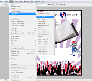
6. I used "Rectangle Tool" to draw a rectangle 
    shape .After that,i click "Layer" and "Drop 
    Shadow" to let my rectangle have Inner 
    Shadow.


7.  I used "Horizontal Type Tool" to write in the 
     rectangle.

                         
8. I wrote "MMU OPEN DAY" above the Open 
    Book and i also use "Drop Shadow" to let the
    words become more beautiful.


9.  I use the "Outter Glow" effect to make my 
     TM University logo become more clearly.


10. Lastly,i double click on the Layer Name and 
      rename all the layer to let me easier to 
      make any changes in the future.


11. I save my Lab 2 in PSD File and JPEG File.
      And this is my Lab 2 in JPEG File.


Sunday 26 June 2011

Lab 1 : Selection


Step by Step :

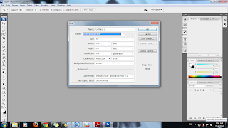
1. Open a new A4 Size file.


2. Open the picture


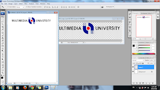
3. Using the "Magic Wand Tool (W)" to select the 
   MMU University and the logo .


4. Double click the background and click the   
   "Ok" to unlock the background and press  
   "Delete" to clear the background color.Let the 
    background become empty.


5. After that,i go to "File" and click "Save As" to   
   save it become a PSD file.


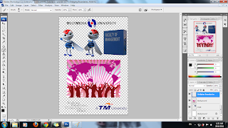
6. Another 4 picture i also use the same method to 
    let the background clear and i use "Move 
    Tool" to move my picture into a new blank A4 
    size paper .

8. After move my picture to the new paper,i press 
    "Ctrl+T" to enlarge my pictures .I am pressing 
    the Shift when i am enlarging my pictures and 
    after that i just press "Enter" key . Another 4
    pictures i also use this method to move it into 
    the new blank paper . 


9. After arrange the pictures , it will become like 
    this.^^


7. I save my Tutorial 1 in PSD file first .


8. I save another copy in JPEG file .


9. Finally , i done my work and these pictures is 
    using on my Assignment "MMU FOM Open 
    Day" oh~~~(^^)~~~